This is Paul's assignment to document at least 20 types that we found around us.The need to complete this assignment was not only educative but made me unusually aware of my surroundings. Always keeping an eye out for interesting designs and quirky fonts or interesting patterns unknowingly created by the most banal things in unusual arrangements.
Like the way the "O" nestles the "Y" making it look like a stick figure.

A simple folding of paper produces this font
(I'v tried this in my collages as well).Liked the simple white placed against the Christmassy background.
 "So good we named it twice" is the tag line need I say more?

This is a printing press near Shoreditch,with a friendly old man who is more than happy to show you around the shop and teach you a thing or two about book binding.
Like the way the "O" nestles the "Y" making it look like a stick figure.
It's a simple Linotype Handle Gothic font but looks amazing because of the steel finish set against a grey-black background
A long awaited Indian touch:)Was quite surprised to find this piece (Pron:"Accha")Its Devanagiri script.Liked the intent of the words trying to bring in the colourfulness of India.
A simple folding of paper produces this font
(I'v tried this in my collages as well).Liked the simple white placed against the Christmassy background.
 "So good we named it twice" is the tag line need I say more?
This is a printing press near Shoreditch,with a friendly old man who is more than happy to show you around the shop and teach you a thing or two about book binding.
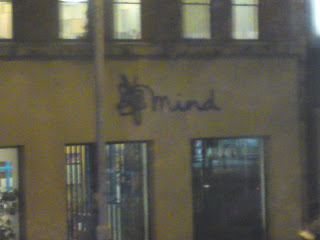
This picture is slightly hazy because it is taken from my camera phone,liked the way the mad contorted logo goes on to write the text.Troubled minds?


No comments:
Post a Comment