30 January, 2011

WalterNewbury-Tryst with the printers

My flatmate wanted his dissertation printed and bound, so we set out hunting for presses in London that would get the job done at prices friendly to the student pocket.Surprisingly we found this quaint printing press called Walter Newbury Partners Ltd(http://www.walternewbury.co.uk). established nearly 116 years ago printing materials for the government and the Queen Mother herself!
Situated on Grangewood Street,with very friendly staff.Who even let us watch the entire process and gave us an informative tour of the process,a special thanks to handsome Glen and the very well informed Gary.


The Prazimark which is an automated machine that imprints the gold lettering on the cover and spine was what fascinated me.Gary told us that initially when he had to set the font and gold foil the letters by hand it would take him hours but after mechanising the process it took only a few minutes,there are apparently only three in London and Walter Newbury Partners Ltd owns one of them!Cheers guys keep up the good work!The pictures are courtesy my friends Venky and Vibha, thanks guys!

22 January, 2011

ISTD-Project Brief

Its been a long and quiet an enjoyable holiday and hardly any blog entries.I'v started this new year with weird mixed feelings ranging from excitement to pure blankness.Dreading the day of attending college actually turned out to be quiet enjoyable.Loved the smell of the coffee beans that hit me,the exhibit that invited me and the brief that excited(s) me.Hoping to make up for lost time in the library this year.
This is the brief of the project we are undertaking this term for ISTD


07 December, 2010

Alas It's over!

Looking back at the 2 months,which look rather short now, I think back to things I have learned or unlearned.
Starting from scratch and coming to where I stand now,there is a noticeable change in me as a designer,maybe not technically(at least as of now;))but I have definitely started to think about different ways of thinking itself!
Every design issue seems so much more easier to tackle with the Six Thinking Men, creative blocks that much more smaller once you just pick up things and start putting them in the moleskin sketchbook (which is my new best friend!) and London that much more friendlier(peace!);)

98...99 and she's hit a 100!

After all the collecting (and in the process driving my friend's mad!), cutting and gluing , more collecting and more than a little help from my mates I have finally finished Darren's assignment of the impossible 100 collages.
At this point I need to thank Vibha my room mate for finding letters and words in the impossible mound of junk I had accumulated. My flatmates who became collage material hunters (bringing back tickets,random posters and all the other paraphernalia you see in my collages below)Thanks guys!Cheers!


30 November, 2010

Rubber stamp Shop

Before I start I must thank Richa for dragging me (rather reluctantly) to this hidden craft shop, its on Bury Place, Oxford Circus.I recommend it strongly to anyone and everyone!
Wether your into patterns or colours,art or craft (or both),sane or insane,too bogged down by VCT essay submission or just out of inspiration visit these guys.Its a nice quaint place with the most amazing collection of rubber stamps and the paraphernalia included.Don't miss the basement, is a treasure trove of brilliantly patterned paper.


Typo-Mania

This is Paul's assignment to document at least 20 types that we found around us.The need to complete this assignment was not only educative but made me unusually aware of my surroundings. Always keeping an eye out for interesting designs and quirky fonts or interesting patterns unknowingly created by the most banal things in unusual arrangements.

Like the way the "O" nestles the "Y" making it look like a stick figure.


It's a simple Linotype Handle Gothic font but looks amazing because of the steel finish set against a grey-black background
A long awaited Indian touch:)Was quite surprised to find this piece (Pron:"Accha")Its Devanagiri script.Liked the intent of the words trying to bring in the colourfulness of India.


A simple folding of paper produces this font
(I'v tried this in my collages as well).Liked the simple white placed against the Christmassy background.


"So good we named it twice" is the tag line need I say more?


This is a printing press near Shoreditch,with a friendly old man who is more than happy to show you around the shop and teach you a thing or two about book binding.                                                                  

This picture is slightly hazy because it is taken from my camera phone,liked the way the mad contorted logo goes on to write the text.Troubled minds?


24 November, 2010

Choice no.1 for VCT essay

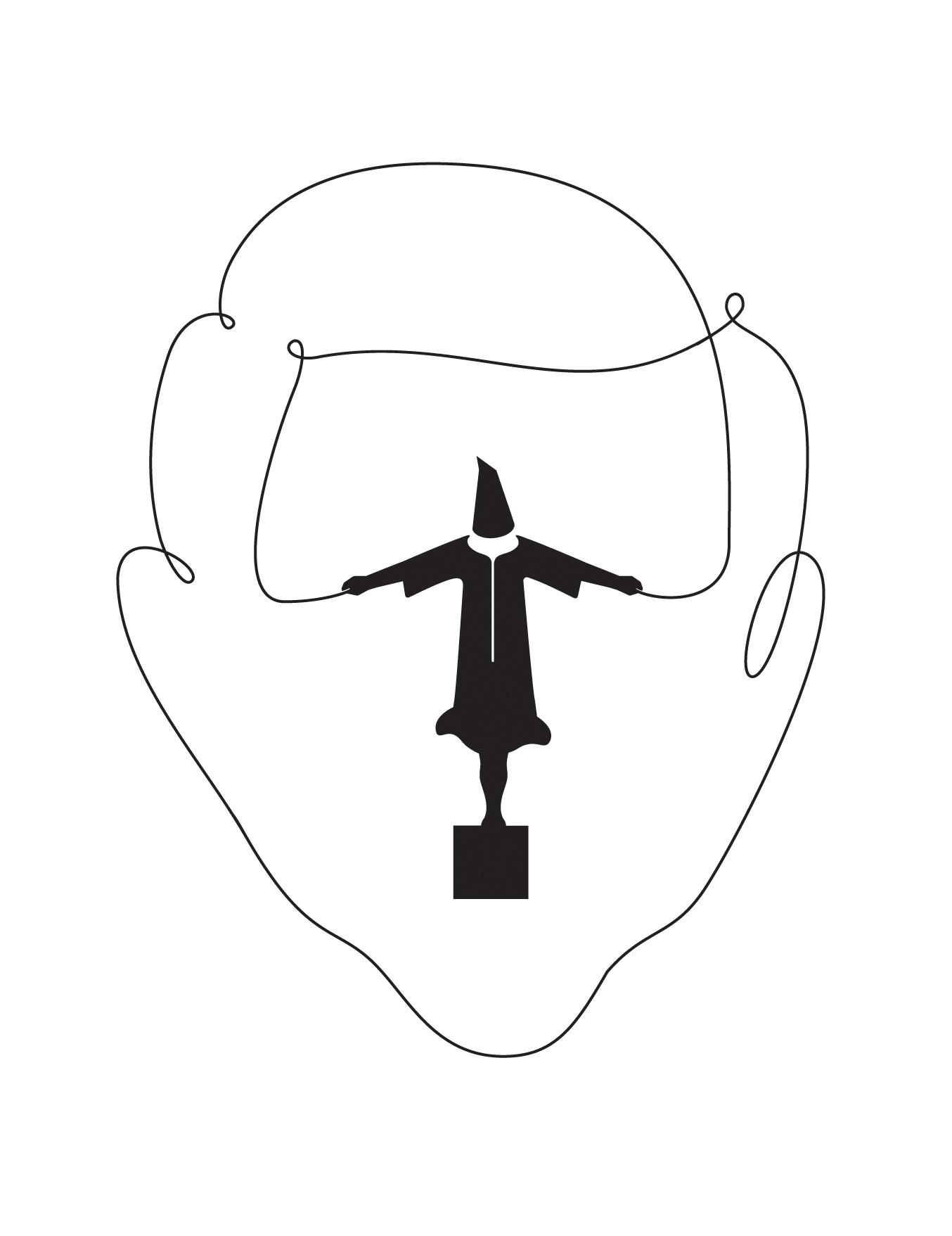
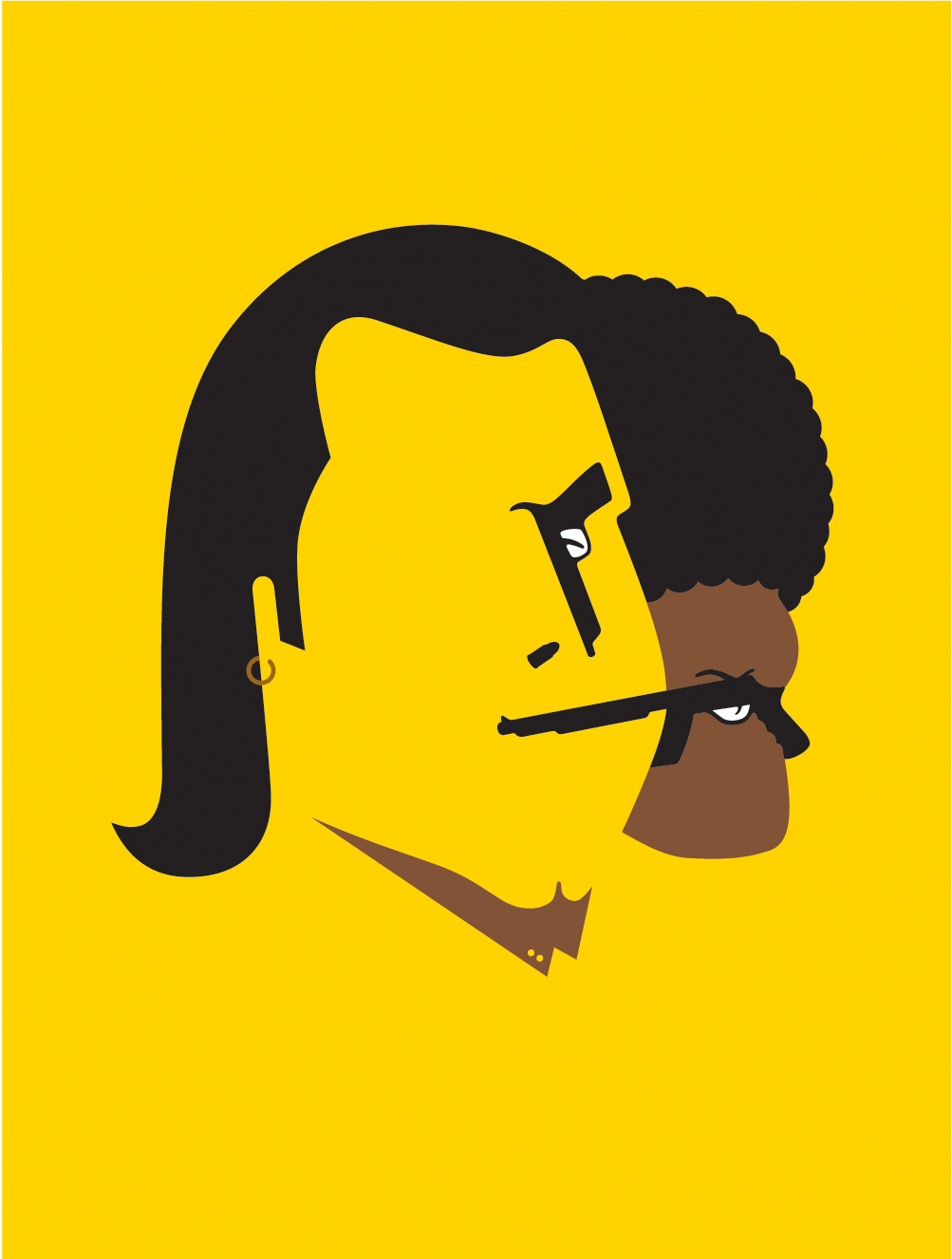
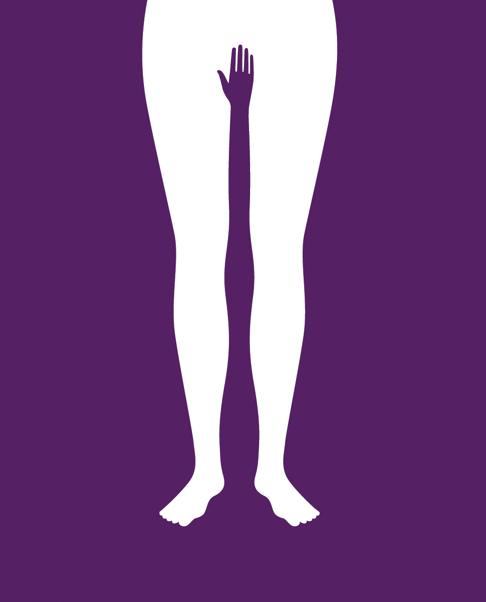
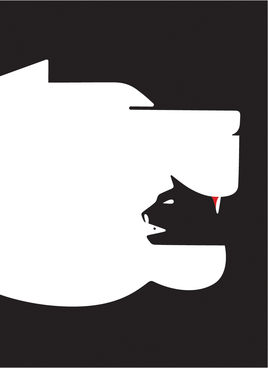
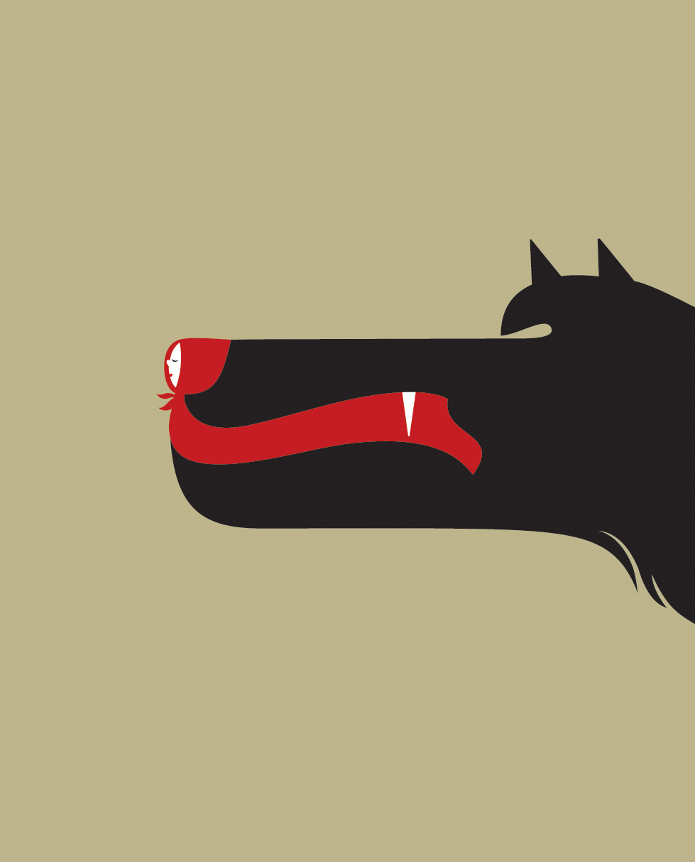
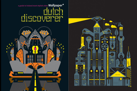
When we actually started out doing our VCT essay I had set my heart on talking about Noma Bar's poster/brochure design for BAFTA 2009.Here are some of his illustrations which are strikingly simple yet cheekily clever.


Do check out Alex Bucktin's blog (http://a-bucktin0710-dc.blogspot.com) ,it was in her blog that I found Mr.Bar.